Journ
A poetry system for the natural standard of inclusive skincare
Introduction
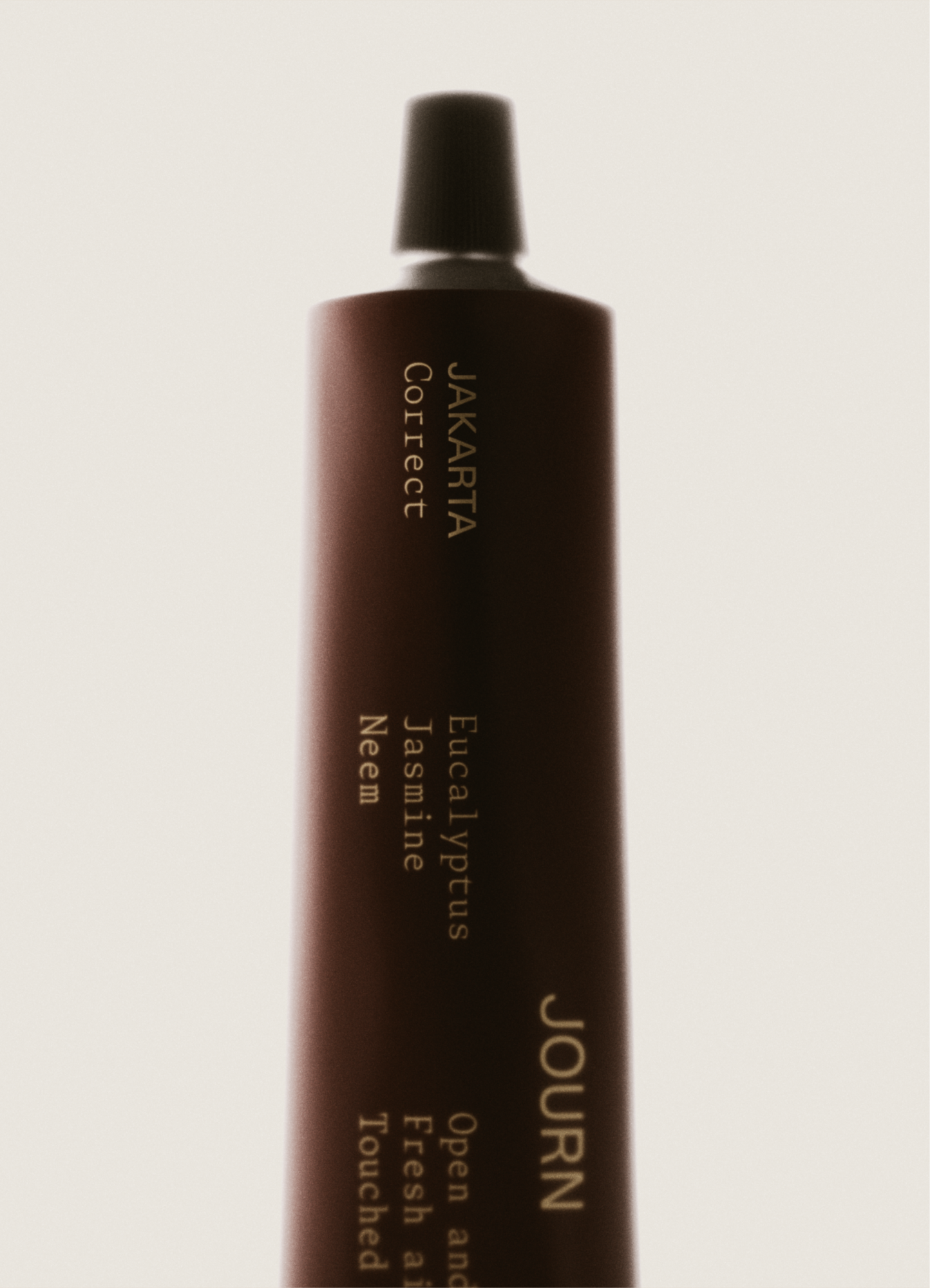
Somewhere between peptide serums and plasma facials, skincare became a feat of engineering. Journ arrived with a different perspective. Its founders were interested in a far more human experience—one that values sensation over optimization, discovery over instruction, and the personal over the perfect.
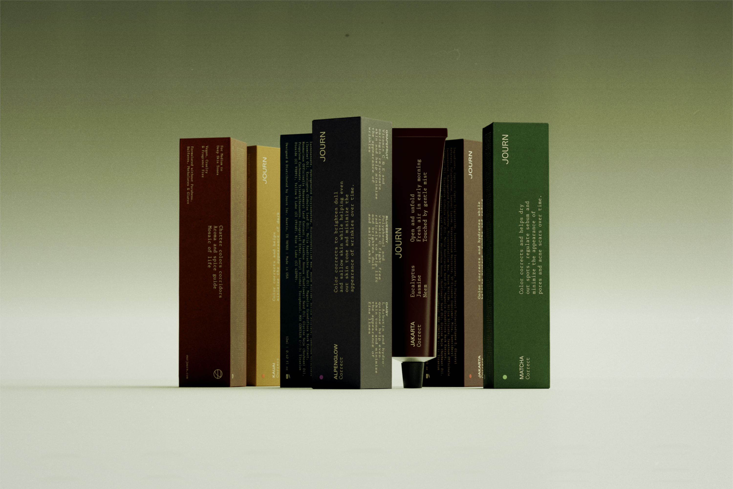
We worked together to reflect that sentiment in a brand evolution that began Journ’s next chapter. Our partnership spanned strategy, direction, language, and design—all of which required the right balance of clarity, depth, and the tension between them.
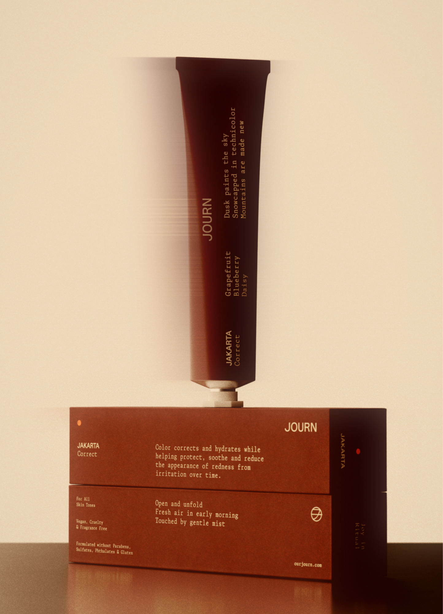
The Challenge
Journ was growing fast. The bigger the collection became, the more important it was to make sense of what held it all together. Our aim was to put Journ’s products into harmony without making everything look or sound the same.
The challenge was to make their differences felt at every level—not just in what Journ said, but in how it showed up online, in stores, and across its entire presence. Journ needed a system that could carry meaning at every scale without sacrificing the nuance that separates its story from others.
The Opportunity
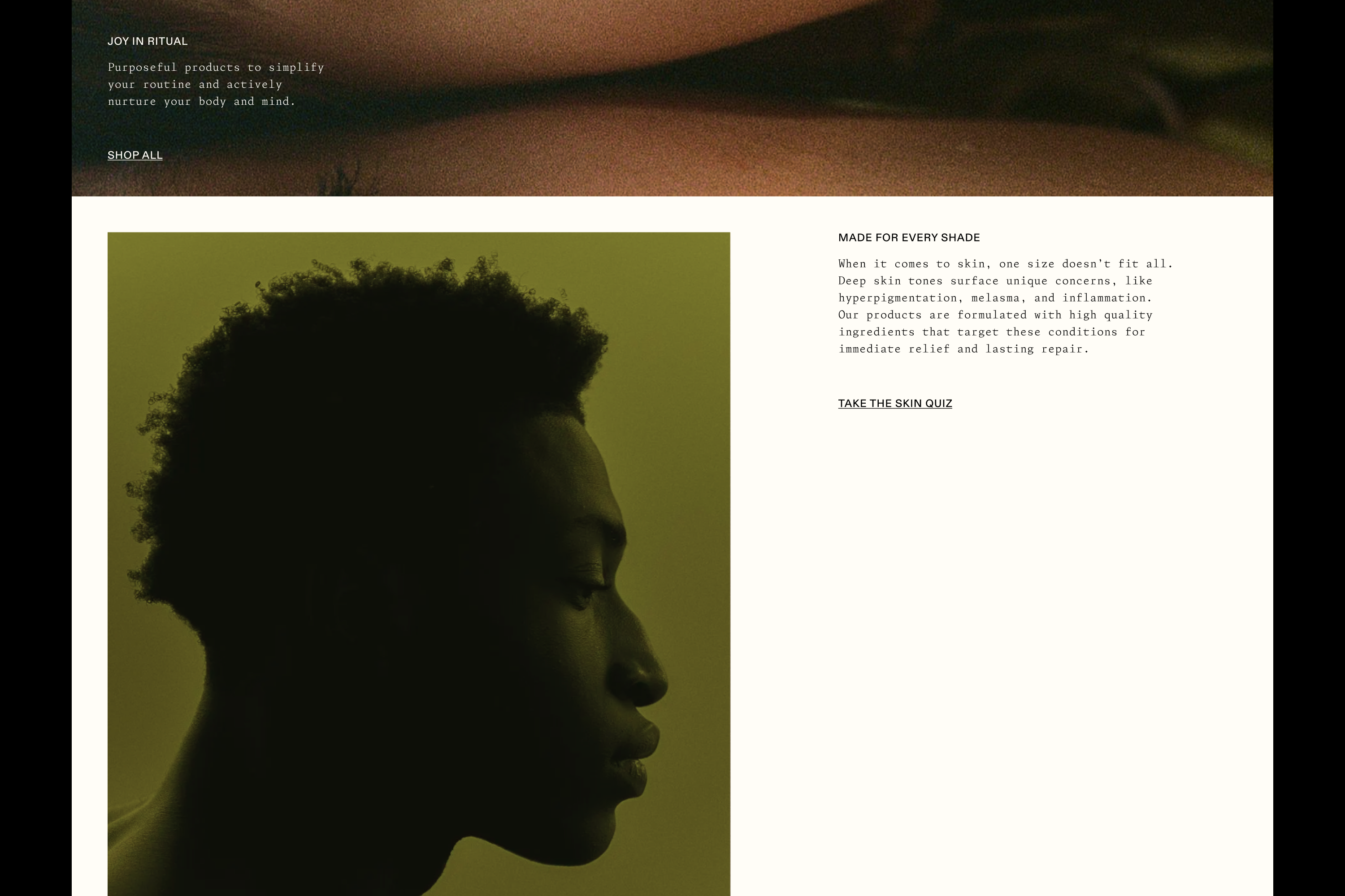
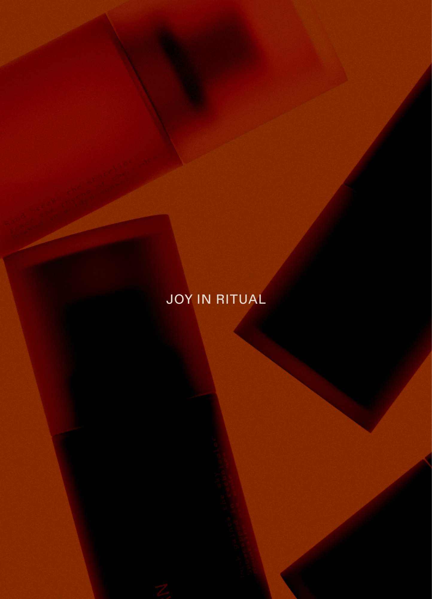
We called it Joy In Ritual. It’s a simple belief at the center of Journ’s ideology—the idea that skincare should be a practice to enjoy, not a protocol to follow. Even if only for a few quiet minutes, that ritual belongs to you. Our goal was to make the most of it.
We started with a strategic platform that gave Journ a way to articulate everything that makes it so special—from natural ingredients to inclusive shades to the global influences behind its offering. Most importantly, the framework arrived with a clear point of view.
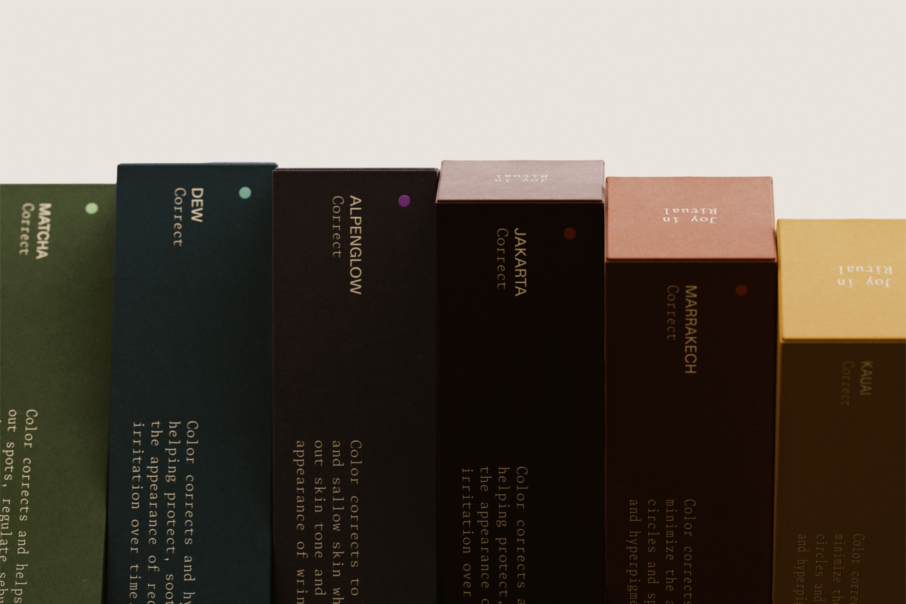
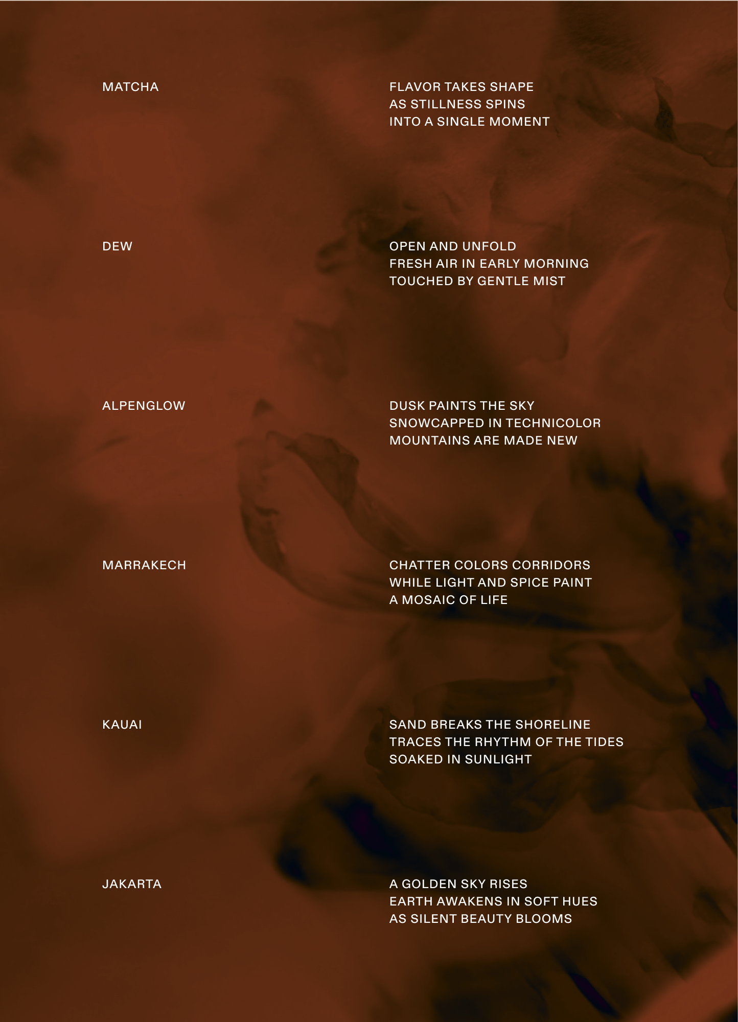
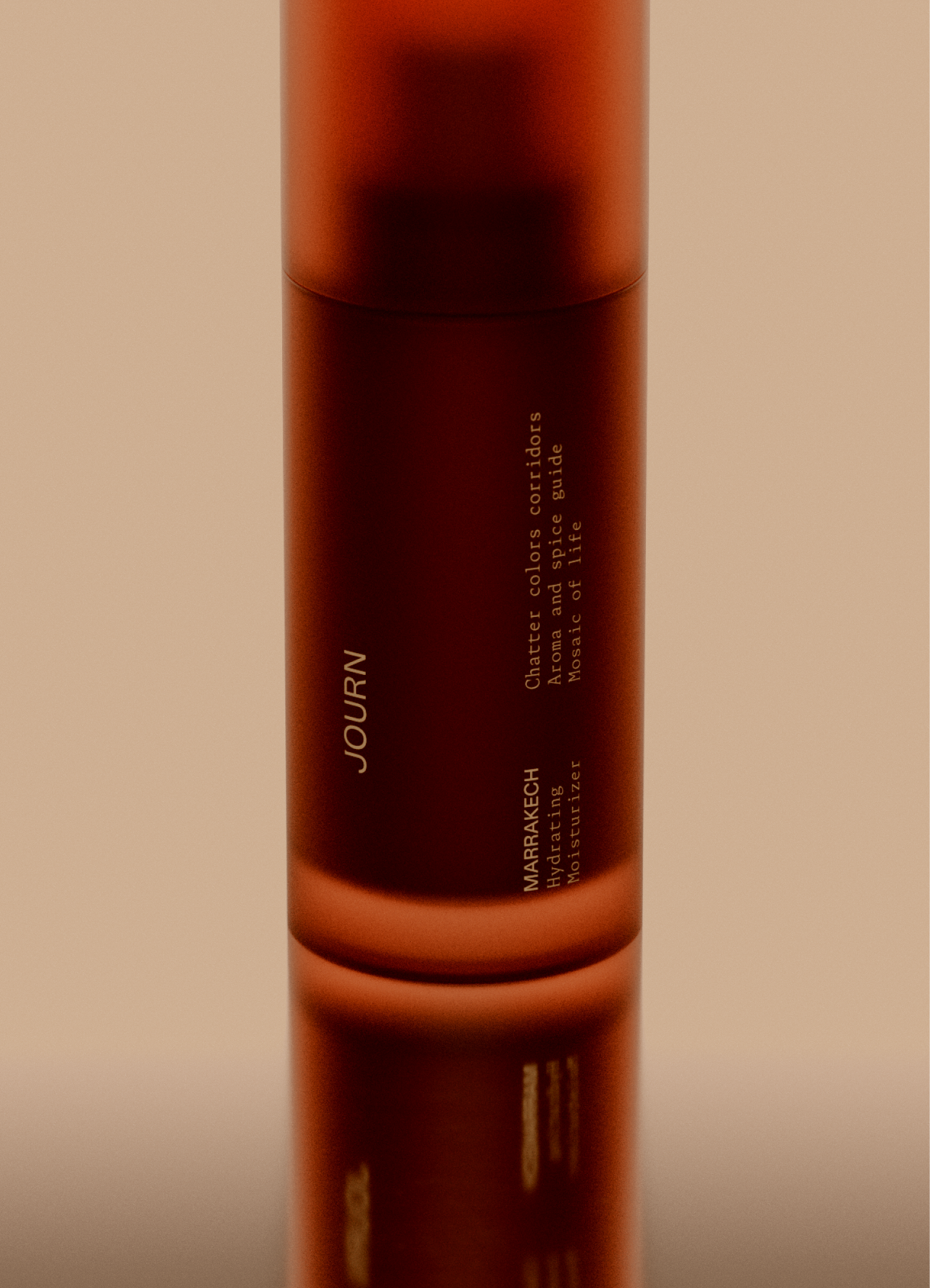
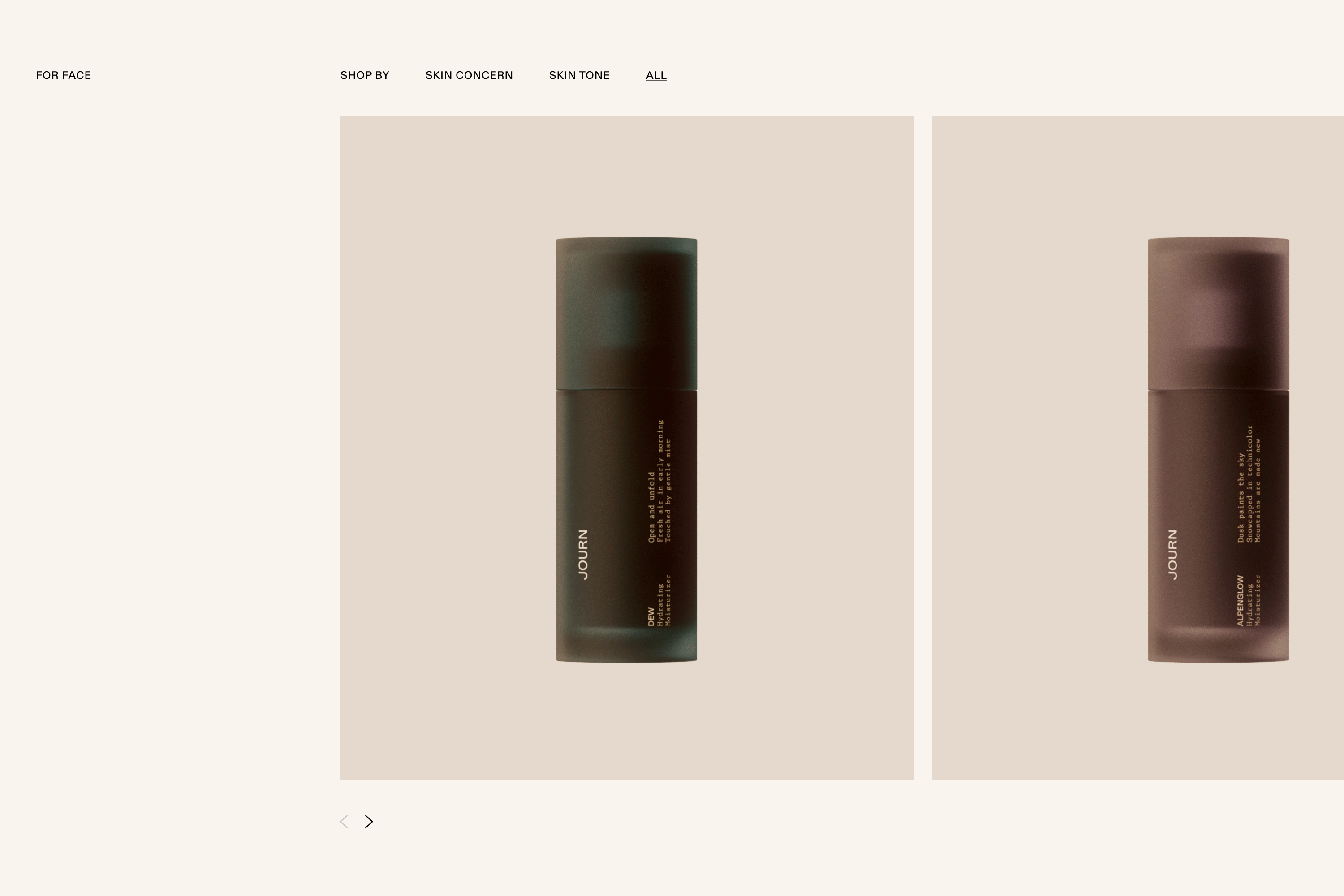
Our team translated that philosophy across the identity and onto the packaging. In one of my favorite assignments to date, I wrote an original poem for each of Journ’s six colorways. From Marrakech to Jakarta, the compositions give Journ’s line of products a distinct sense of place.

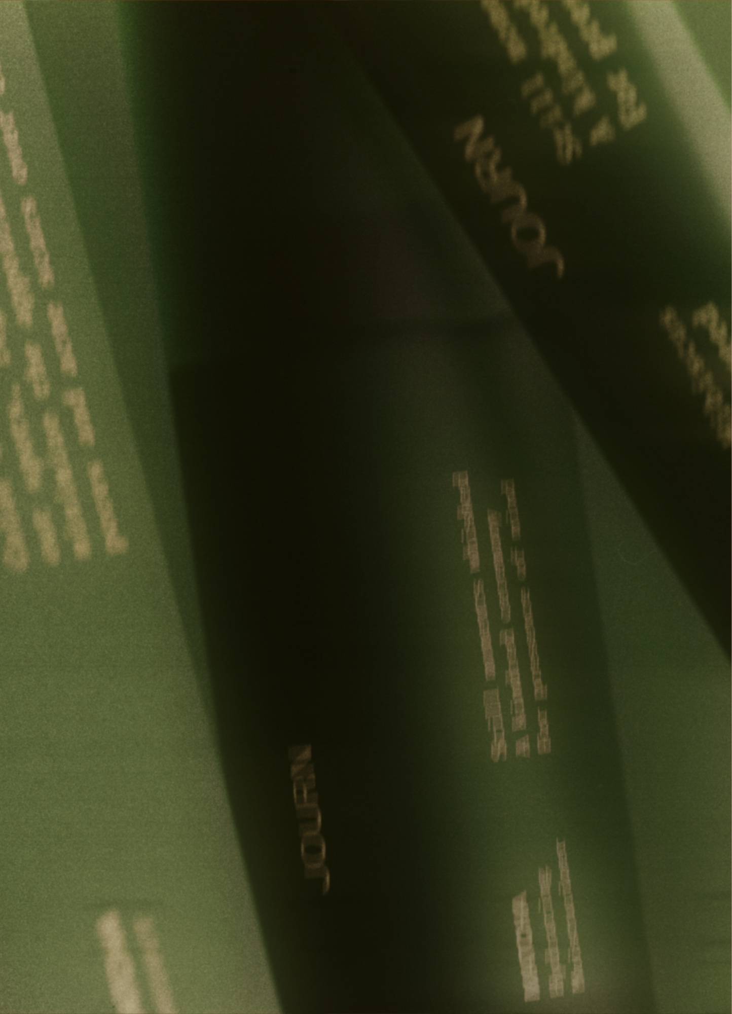
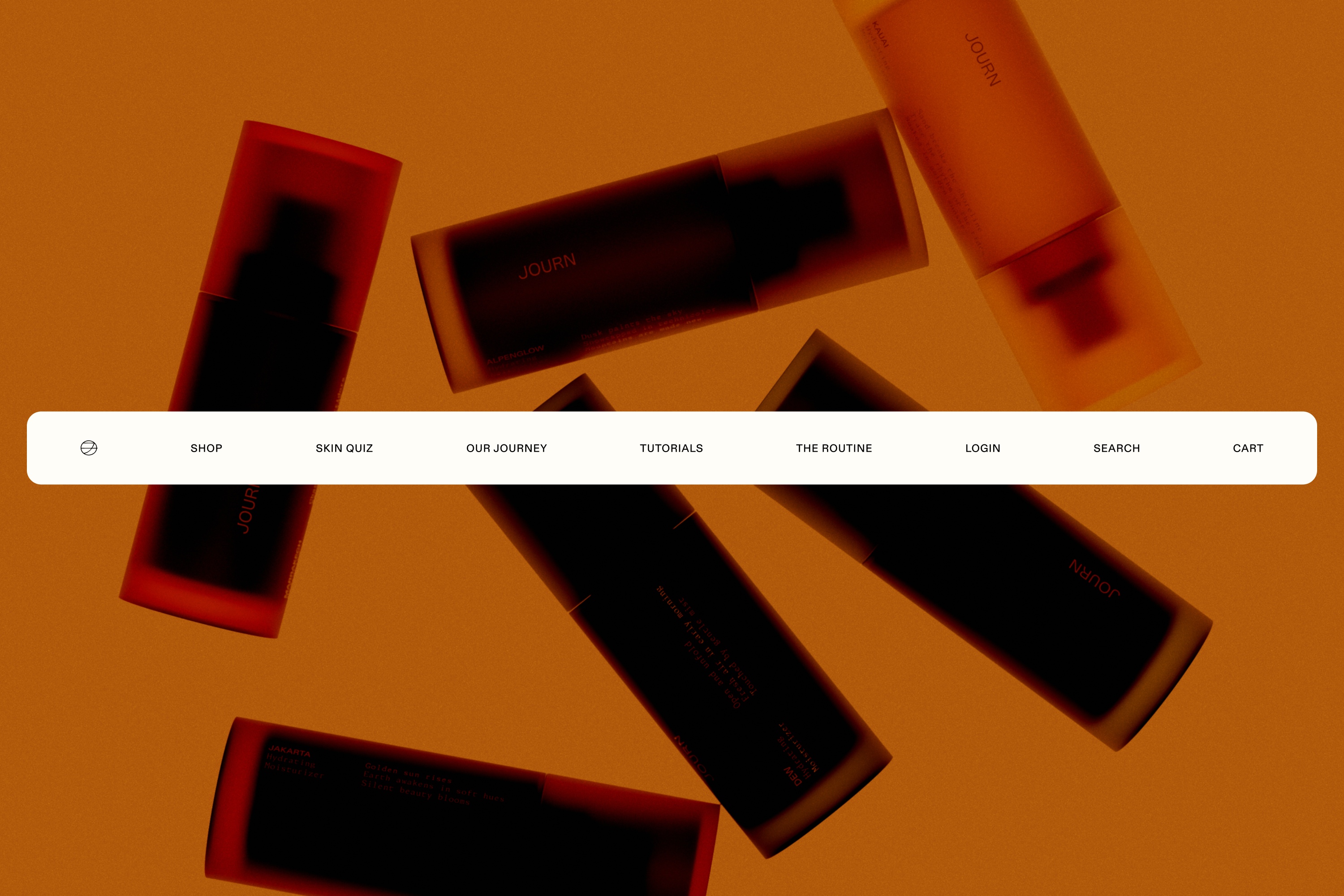
In a category full of familiar cues, we gave Journ a visual world of its own. It was designed to catch the eye first—then give people a reason to keep looking. Brought to life by rich color and grounded textures, what emerged is a brand with enough character to stand apart before you ever read the label.
- Brand Design
